Understand the choice
Present game rules, product information and pricing before commitment.
03 / The UAE Lottery / 2025 to 2026
Connecting draw tickets, scratch cards and e-instant journeys across web, mobile and retail—with clear order states and responsible-gaming controls.
Overview
I worked across lottery experiences on web, mobile and retail terminals. Each channel has a different context: players manage their own choices online, while cashiers need to keep customer details, orders and delivery in view at the counter.
This case study brings those journeys together around a shared principle: make the selected product, cost and transaction state clear, and give the player an accessible route to limits and support.
Present game rules, product information and pricing before commitment.
Keep selection, payment and ticket delivery distinct across devices.
Make responsible-gaming tools part of the wider experience.
UX research
The case-study review compares the public desktop and mobile journeys with the earlier and newer retail POS designs. It focuses on information hierarchy, order visibility, recovery and player control—the moments where a screen must make the next decision understandable.
Compared number selection, catalogue structure and responsible-gaming information across desktop and mobile.
Mapped selection, review and completion using the two supplied POS design files.
Compared success, print failure, retry guidance and invoice delivery as separate states.
ObservationThe mobile number picker presents entries in a horizontal sequence.
Design implicationKeep the active entry and total visible as people move between cards.
Question to validateCan a player identify the number of entries and full amount before confirmation?
ObservationThe newer POS keeps customer details and itemised orders in one workspace.
Design implicationPreserve order context through review and payment.
Question to validateCan a cashier correct an item without losing the customer or order?
ObservationThe original completion export had an empty preview panel and no success icon.
Design implicationPair explicit confirmation with a visible ticket preview.
Question to validateCan a cashier distinguish payment success, ticket issuance and invoice delivery?
ObservationPlayer Controls separates deposit limits, time-out and self-exclusion.
Design implicationExplain the effect and duration before a control is applied.
Question to validateCan a player choose the appropriate control and describe what it changes?
Source: interface and design-file review for this case study. These observations are not participant interview findings.
Usability evaluation
A useful session asks people to explain the state they see, complete a task, and recover from a problem. The record below defines the tasks and evidence to capture, so design feedback can be traced to a specific decision.
Separate player and cashier sessions. Use sample orders and prototypes, with no real purchase.
Record completion, assistance, wrong turns, state interpretation and the participant’s explanation.
| Task | Evidence to record | Status |
|---|---|---|
| Review a draw ticket | Correct explanation of numbers, entries, draw count and total. | Not recorded |
| Review a scratch-card order | Correct card and quantity; ability to change an item. | Not recorded |
| Explain order completion | Distinguishes payment, ticket preview and invoice actions. | Not recorded |
| Recover from a print failure | Identifies paper-out cause and available retry action. | Not recorded |
| Find an appropriate player control | Understands the control’s effect and duration. | Not recorded |
Design review record
Participant counts, quotes and measured outcomes are not reported because completed study records have not been supplied. The design review above records portfolio feedback and revisions.
Lottery buying
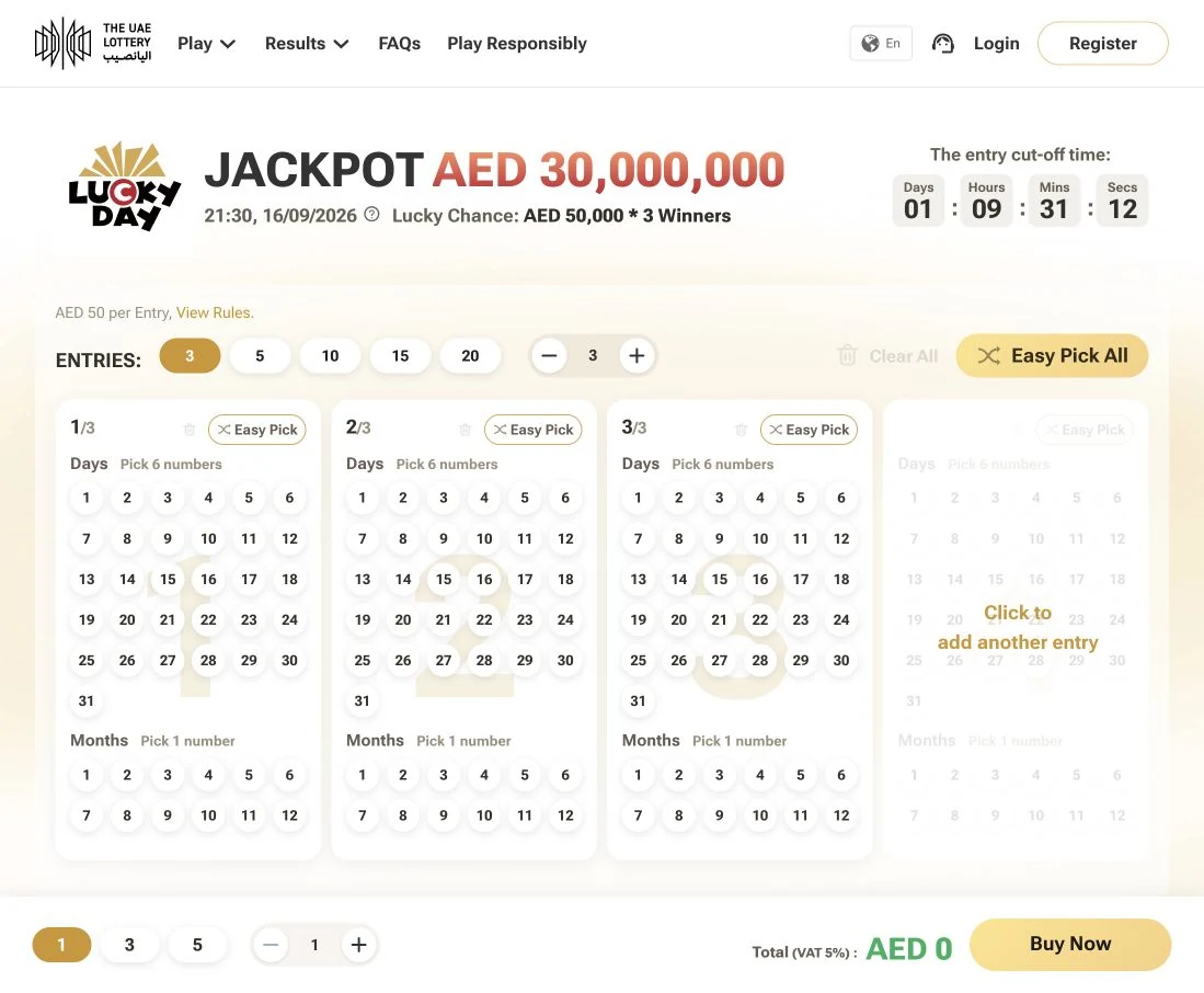
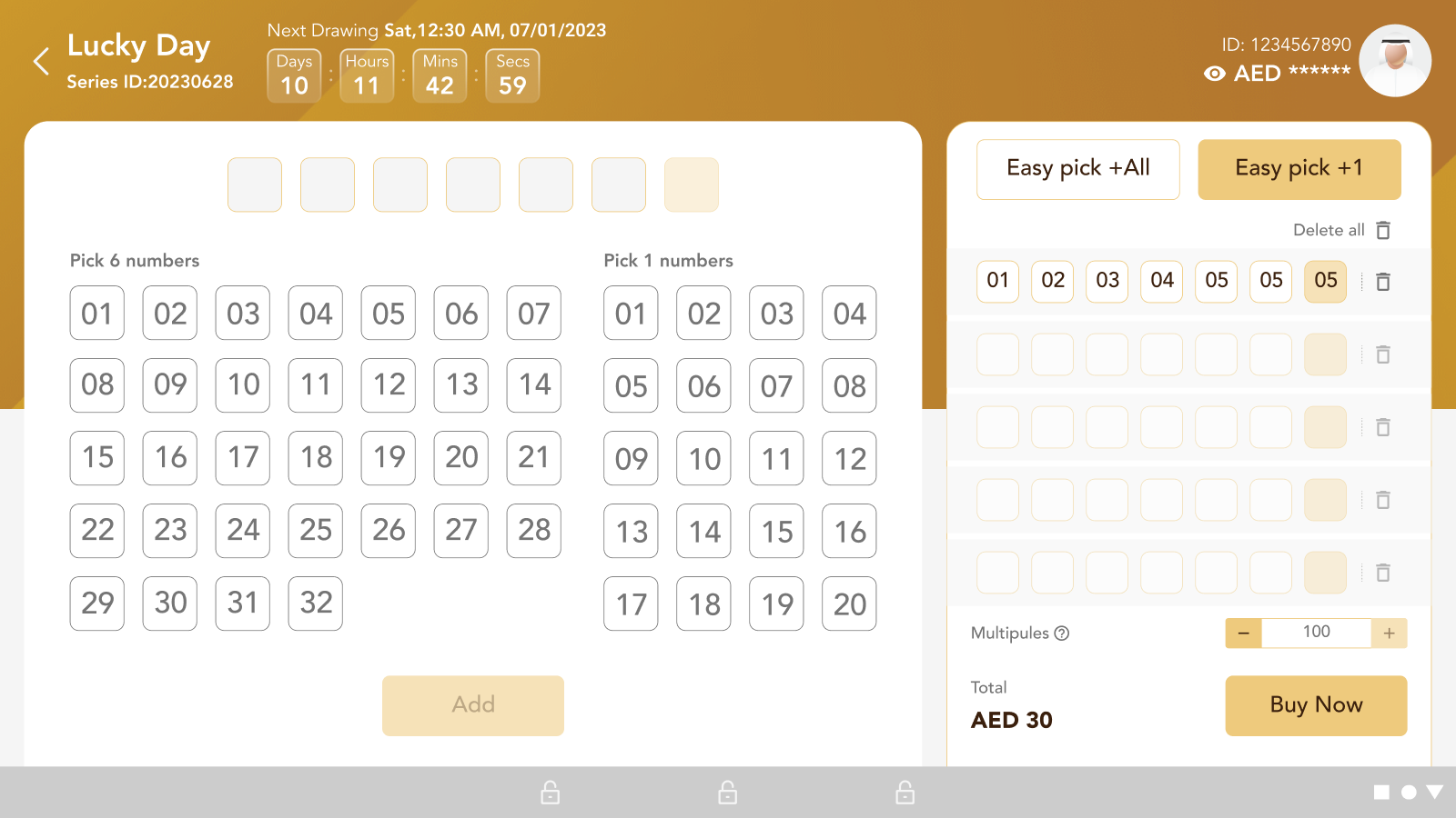
A draw-based ticket combines several decisions: the game, selected numbers, number of entries and draw count. The interface needs to keep those decisions connected to the total, with a clear boundary between editing an entry and confirming payment.
Identify the draw, entry price and rules.
Separate the day and month number groups.
Check entries, consecutive draws and the total.
Resolve payment, then make the ticket available.
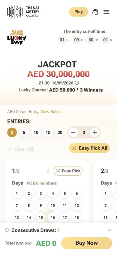
Lucky Day · Entry selection · View The UAE Lottery website ↗ · September 2026
Desktop places entry cards side by side. Mobile presents the same selection groups in a narrower, horizontally browsable layout.
The amount and purchase action remain at the bottom, keeping cost visible while the number grid occupies the main screen.
The journey model separates review, payment and ticket delivery. A pending payment should never appear as an issued ticket.
Scratch card buying
Scratch cards use recognisable artwork and a fixed product price instead of a number-selection grid. The journey moves from comparing products to reviewing the chosen card and quantity. At retail, the cashier sees those choices as itemised order lines.
Identify the product, price and rules.
Keep the selected card recognisable in the order.
Show items, quantities and the full amount.
Distinguish payment from receipt or ticket issuance.
Scratch cards · Product catalogue · View The UAE Lottery website ↗ · September 2026
The catalogue references show discovery on web and mobile. The retail collage below shows the itemised purchase stage from the POS design.
E-instant buying
An e-instant journey needs a clear handoff from the catalogue to the game. This flow model makes the price, rules, eligibility and player controls visible before a paid session starts, then distinguishes the session result from the next action.
Catalogue → review → confirmation → session record
Artwork + game name
Rules and price
Player controls
Chosen game
Entry amount
Change or leave
Eligibility + limits
Payment status
Clear next step
Result and receipt
History access
Exit or take a break
Before commitment If a limit or restriction applies, explain it and preserve a clear exit.
After interruption Recover the existing transaction state before offering another attempt.
Illustrative journey model. Original e-instant game and checkout screens are not included in this case study.
Responsible gaming
Responsible gaming belongs alongside the purchase journey. The official experience provides deposit limits, time-out and self-exclusion, with self-assessment and support available through the same navigation. The design priority is to make the effect of each choice understandable before it is applied.
Reach Play Responsibly from the main navigation.
Compare limits, breaks and self-exclusion.
Explain the duration and account restrictions.
Show the active control and how to access help.
Responsible gaming · Player Controls · View The UAE Lottery website ↗ · September 2026
Daily, weekly and monthly deposit limits support a deliberate budget. The interface should explain when a change takes effect.
Time-out and self-exclusion serve different needs. Their duration and restrictions need clear language before confirmation.
Self-assessment and Takalam support sit alongside the controls, giving people a way to seek help beyond an account setting.
Retail POS · Before & after
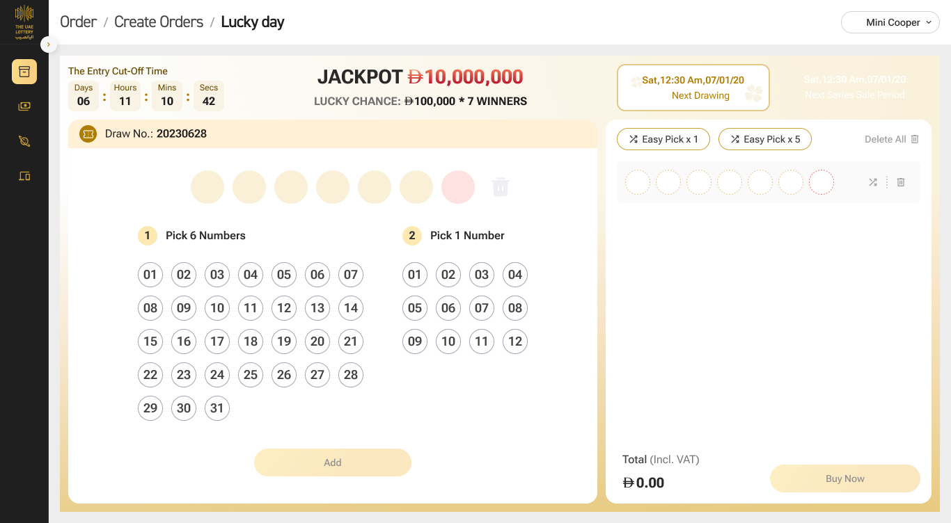
The earlier design centres on the selected game and the player’s plan. The newer POS brings customer information, itemised orders, payment methods and delivery actions into a consistent workspace. Compare the same moments across both design files below.
 BeforeAfter
BEFOREThe earlier layout uses a broad number grid and a dense entry panel.
AFTERThe newer design groups selection into two numbered steps and separates the active entry from the order summary.
Drag the divider or use the arrow keys to compare. Screens from the earlier and newer POS designs; the completion view is refined with a sample ticket for this case study.
Retail order flow
The cashier needs a clear view of what is selected, who the order belongs to, and which step is complete. These screens make the transition from selection to confirmation explicit.
Build and review the active entries.
Keep customer details and itemised orders together.
Show the total separately from the payment method.
Distinguish order success from invoice delivery.
Scratch cards · Retail
Scratch cards do not need a number picker. The order view instead presents product names, series, quantities and pricing alongside the customer record and summary. This retains the same review structure while adapting the information to the product.
Recovery states
The newer design names the failure, identifies the printer problem and displays the retry count. Completion offers invoice printing and email as separate actions. Keeping these states explicit helps the cashier understand what still needs attention.
Retail images use the supplied design files; the completion view is refined with a sample ticket. Dates, prices and account fields are design sample values, not current game terms.
The device can change without changing the meaning of pending, paid, issued or failed.
Selected numbers, quantity and total stay available until the player confirms the purchase.
Pending, failed and paid receive different guidance so people do not create a duplicate attempt.
Digital receipt, issued ticket and retail print output remain distinct parts of completion.
Business impact
Create a consistent purchase journey across web, app and retail so more customers can complete a ticket and recover from payment or printing problems.
More completed ticket purchases across every channel
Faster counter service during busy retail periods
Lower support and reissue effort when a transaction fails
Measuring after release
These are success measures for post launch evaluation, not claimed results.
Compare additional completed purchases and cashier time saved with delivery, training and support costs.
Final reflection
The final direction connected web, mobile and retail through the same journey language, while allowing each device to support its own context and pace.

Find your line. Chase the sunset.
Internet required. Check each game for controls and ad availability.
Product catch-up · 2 suggestions need your review
Review suggestionsThe team discussed Friday. Final timing depends on the supplier’s response.
Source · 18:42